Keep These Tips In Mind While Designing A Business Brochure

Despite the hegemony of digital marketing in the current era, print collateral still plays a crucial role in a brand’s marketing strategies. The professional designing of brochures requires a high budget allocation. This allocation establishes the brand’s reputation in public.
Brochures are also known as versatile marketing tools. Individuals distribute brochures at trade shows, put them in brochure racks, send via direct mail, and even publish on their company’s website. It is because of the portability of posters and brochures. Usually, the audience prefers to grab brochures rather than engage with salespersons.
There is a fundamental for brochure’s designing as per which the text content should never exceed the desired word limit. The Universally accepted word limit is set around hundred words. Due to such acceptance, it becomes essential for designers to maintain word limits on poster content.
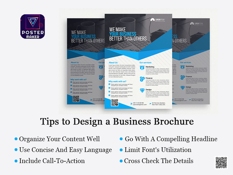
To design an effective and professional brochure, individuals need to consider certain tips, which are stated as follows:
-
Organize Your Content Well
Usually, the size of brochures varies in length and content. Despite this variation, some standards need to be maintained. These formats include:
- The front panel must include the company’s logo and headline.
- The inner panels should be inclusive of content depicting information on products/services.
- The end panel should involve contact details and a call to action.
While creating content for the poster, individuals should identify the audience’s mindsets. The identification may cover the consideration of age, gender, location, role, income, interests, and challenges. The identification of the above-mentioned factors decides the poster’s tone, language, and content. These parameters also assist individuals in selecting call-to-action. For example, an offer for a free white paper would likely be executive’s interest, whereas a free coke with a pizza order will be good for college students.
Individuals should prepare a note of these factors and consider them while deciding their audience’s position in a purchase cycle. The designers should also avoid the wastage of available space by describing their organization’s history.
-
Go With A Compelling Headline
The headline of a poster plays a crucial role in determining whether a prospect will pick up and read a poster or neglect that aside.
Due to the vitality of headlines, individuals should avoid using irrelevant headlines with the brochure’s content. The irrelevancy of content can significantly provoke a reader’s curiosity.
For a good design, the designers can use headlines that can spark the reader’s interest while describing the insight of the poster’s content. They can also use “power words” like free, quick, easy, results, exclusive, sale, proven, etc.
-
Use Concise And Easy Language
The primary focus of the poster’s content should be on a single product or service. A usual poster design hosts a word limit of a maximum of 350-450 words (without visuals). So, to avoid a patchy outlook, it is good to keep words, sentences, and paragraphs short. The editors should work ruthlessly and work with the relevant information and leave room for white space and other visuals.
Also, the inclusion of bulky text can provoke readers’ attention. To avoid such a cause, the designers should use sub-heads liberally. With the Huepix Poster Maker App, individuals can design a professional poster including callouts, pull quotes, and tables.
-
Limit Font’s Utilization
Individuals must choose typefaces or fonts that are easy to read and consistent with individuals’ brands. They should also avoid the use of multiple fonts because the inclusion of multiple fonts can create vagueness. This vagueness may irritate the viewers because of which they could avoid the poster’s exposure.
With the Huepix Poster Maker for Android, individuals can opt for a font pattern from a wide range of sizes, spacing, and colours. The selection of fonts should also consider the readability so that their viewers would not have to put their efforts into reading the brochure.
-
Include Call-To-Action
The ultimate goal of any marketing brochure is to persuade readers to take the desired action. The inclusion of call-to-action should be placed on the end panel of the brochure near the contact details. To boost response rates, individuals can offer an incentive, like promo codes or other gifts, as a call-to-action.
-
Cross Check The Details
Before sending the brochure draft for printing, individuals should check the inclusion of logos and contact information in the poster design. They should also check the inclusion of other details, like:
- Purchasing Information- This includes the process through which the viewers can take actions like ordering details, availability of payment options, guarantees, warranties, refund policies, etc.
- Visitor’s Convenience– This section should include content defining the facilities and services available with the organization or group like working hours, seasonal times, admission rates, size of groups, direction to the venue, etc.
- Legal Information: This section should be inclusive of contents like copyrights, trademarks, registration marks, etc.
With the Huepix Poster Maker App, individuals can work with branded templates for their posters. These layouts help in avoiding mistakes during poster preparation.


